About a month ago, I detailed the design of an album cover for British electronic band, Kramnik. In designing the logo, I paid close attention to the clients’ needs as well as past trends to determine what kind of logo I could design for them based on the resources, ideas and ingenuity I had. The result was my submission to 99designs.com for their corresponding contest prior to the release of their 2nd album, “Double Agent”. 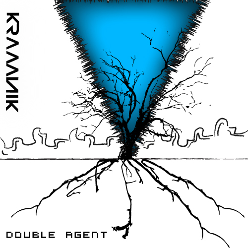
Having only one other image to work off of (their prior album), it was a bit difficult to really sense a common theme that I could pull out towards carrying the bands’ image onward. Furthermore, the band was specific about staying away from certain representations or themes that had appeared on the first album cover (other than their logo). The band’s lead singer also insisted not to use his likeness anywhere on the album cover. Other than those requirements, the brief asked for a design which involved “strange mixes of creatures, places or things”, something “pleasing to the eye and eccentric” and perhaps even “otherworldly”.
Looking at other electronic album covers provided a bit of a hint into the identity that Kramnik was going for but rather than stick with the tried and true template of other electronic albums (many of which involved bright flashy colors, bizarre themes or skewed representations of the bands’ actual members) I tried to stick to a clean, simple approach that would still insinuate chaos  and get a viewer’s attention. To reach my result, I needed a basis to start from, so I started from the most “natural” place, a photo of a large majestic tree found at Avery Point in Groton, CT. The iconic image I photographed would become the basis for the album cover. The photograph (shown right) would need quite a drop in brightness and contrast. Once achieving that, it was simply a matter of extracting the form of the tree, after which I planned to alter its form and transform its alluring offshooting branches into something else entirely. Much like Kramnik themselves, I was molding something established into something new to serve as a motif for their album cover design.
I achieved successful “extraction” by  using the “Live Tracing” feature in Illustrator and cutting my colors down significantly. In doing this, it was easier to select out the tree and come up with this template (or beta) for the album cover. To further articulate this “mechanical” behemoth, I carefully selected some of its more prominent branches and redirected them downwards (sometimes skewing them as needed) to create the illusion of ominous roots (or wires) reaching into the unknown surface. The image’s lack of color is what provides its overall gripping affect, and after fusing in further elements (such as a futuristic cityscape and an ominous blue glowing vortex that threatens both worlds of existence) the result is a successful mish-mash of elements to compliment Kramnik’s style.
