
One of the more excruciating and most appreciated jobs of the graphic artist (or graphic innovator, in this case) is the design process. The design process can be a tricky elaborate mess of ideas, concepts, research, shapes and elements that don’t quite mesh. Sometimes the perfect solution to a graphic “problem” is straightforward but more often than not, it will involve making several wrong turns before finally reaching a satisfying conclusion.
In my upcoming video series, “Behind The Logo” (out now on Youtube), I’ll be exploring this process as it pertains to simple logo design. Most logos pride themselves on having a sense of simplicity and yet some of the greatest logos still manage to throw some curveballs at their viewers that propel them to new heights and maintain interest for generations.
In my inaugural episode, I will be designing a logo I design each and every year. It’s the Christmas logo and while the process has become somewhat methodical, it’s a great way to sharpen my skills as a designer and showcase in simple to follow steps how I reach my conclusion.
Much like with any artistic endeavors, there will be disagreements, conflict and several phases of revision and so, some of that is detailed in the video series as well.
I thought, before I set out on that task however, I’ll need a logo for my new web series. It would just sting with irony if I didn’t employ some kind of simple icon, right? So I’ve constructed, fittingly enough, the following logo for my “Behind the Logo” web series, premiering today (November 15, 2014) on Youtube.
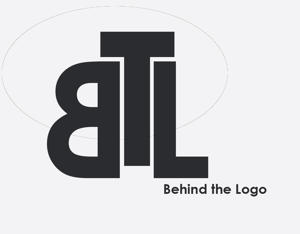
The main logo, using primarily type to cleverly represent my new web series, “Behind the Logo”
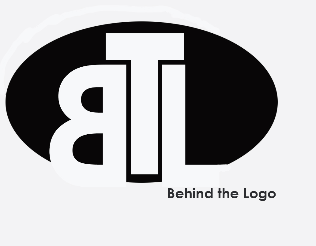
A dark variant of my official “Behind The Logo” design to show up on darker surfaces. The type is still front and center, but is nicely framed by a round, black border.
