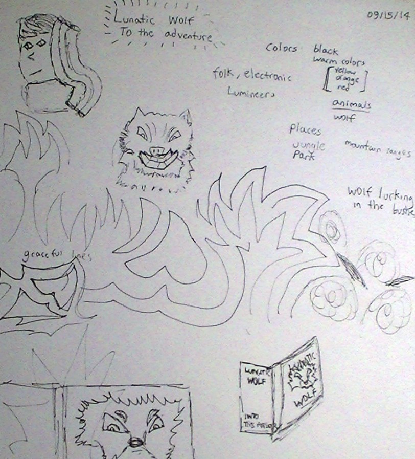
A simple line can spur inspiration. Bringing a concept from the mind to the paper is a dramatic step for any designer and begins the wheels turning on what can be a rewarding graphic endeavor. In many cases, there can be several sketches or brainstorming sessions before a final decision is arrived at.
Last month,one of my design challenges was to create an engaging album cover for folk artist, Lunatic Wolf. This was one of my more in-depth productions of the past month and it was helped along by a series of elaborate (sometimes not so elaborate) process sketches. Sometimes, my sketches turn into a series of instructions, as I try and keep in mind the colors, themes and elements the client would be interested. For this project, the client wanted wildlife somehow represented, along with soft colors, but were also open to some intrigue and mystique. I toyed around with many ideas and my original basis sketch served as a good basis for the final design.
 Sketching letters can be both inspiring and an integral part of the design process. Depending on the project, I still sometimes prefer to use hand drawn letters. Sometimes these letters are based on true computer fonts (emulated using stencils or tracing) but more often than not, I’ll use sketched letters to achieve effects that would be more difficult to achieve on a computer. The benefit in merging the hand drawn and digital representations is that I can freely transport between the two, making edits via computer that I couldn’t make on paper, and vice versa. For my sports t-shirt design, I wanted a certain kind of lettering to spell out the name of Zemgus Girgensons’ iconic first name. I wanted a bold font but I also wanted the spacing between the letters to be more creative and varied. I used a change of scale and angles to achieve this affect and fine tuned it in Adobe Illustrator to give it a polished look.
This sketch of the Buffalo Sabres logo (seen to the right) was one of those  things that came about later in the design process. The vector illustration of the freight train was simply that, a vector creation made solely in Illustrator, but for some reason, I strongly preferred my hand sketched varient of the Buffalo Sabres iconic buffalo. The lines and curves of the hand drawn sketch gave the piece more motion and so I was able to import the sketch and incorporate it into my design.
I should note that not every design of mine is so heavily reliant on sketching. However, even in those cases where sketches may never appear in the final design, they are almost always an indirect inspiration as I start all of my graphic projects by sketching several prototypes before deciding what to design on the computer.
In some cases, things fall into place where (either by design or accident) sketch and digital representation can successfully co-exist within the same design. This is just one of many ways I attempt to innovate in the graphics field.

